-
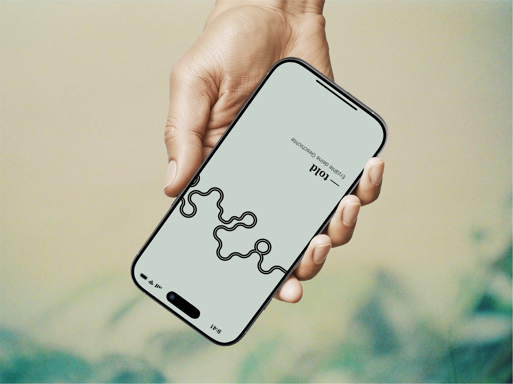
told
The bachelor’s project Fluchtroute Design focuses on the asylum process in Germany, especially the hearing at the Federal Office for Migration and Refugees – a decisive moment for the procedure. The developed app prepares refugees for this appointment by helping them tell their personal stories of flight in a structured way and in their own words – clearly, safely, and with self-determination. By combining individual storytelling with standardised data collection, the tool supports both sides: it gives orientation and a voice to those affected while easing the burden on the system.
-
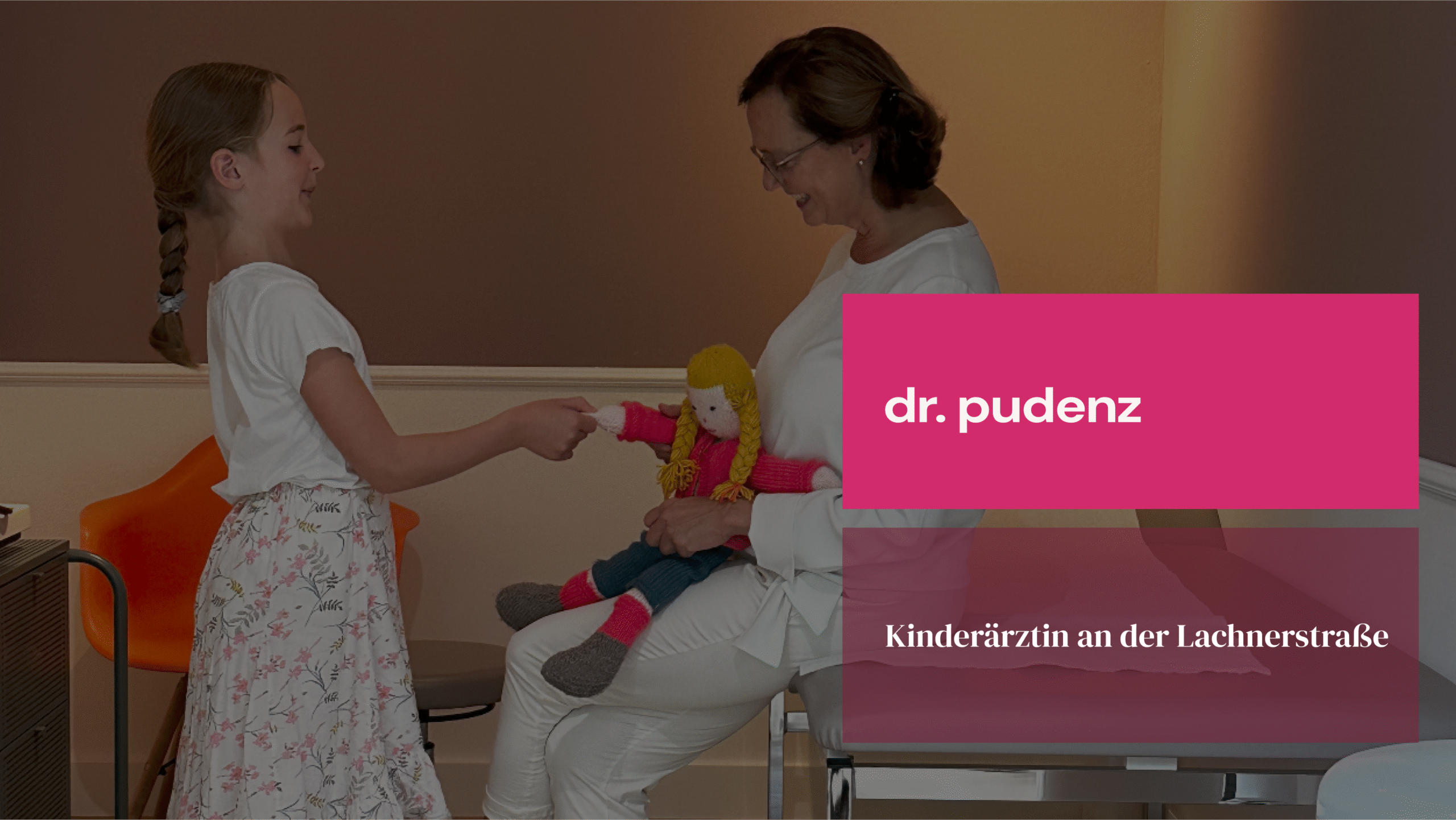
Pediatrician Dr. Pudenz
During my internship semester at Neustart Munich, I updated the corporate identity and redesigned the website for the pediatrician on Lachnerstraße. The collaboration was defined by a clear vision and a refined sense of style. I rebuilt the WordPress site from the ground up, structured the content from a user perspective, and documented all design elements in a concise design guide. This allows the visual identity to develop easily over time. The project was special to me because it resulted in a real, tangible outcome.
-
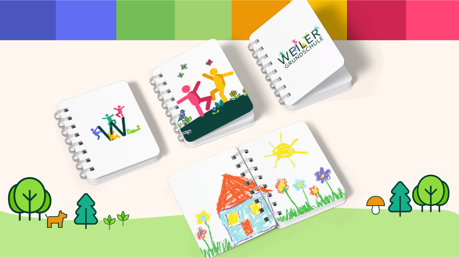
Primary school Ebersbach Weiler
For the Ebersbach-Weiler Primary School, I completely redesigned the corporate identity and developed a new website. What makes it special is that the site is run by a student editorial team. My role was to lay the foundation. Through several workshops, I provided the knowledge needed to design and maintain the WordPress site. Today, the students work together with the principal, Mrs. Teufel, to further develop the content and actively shape the project.
-
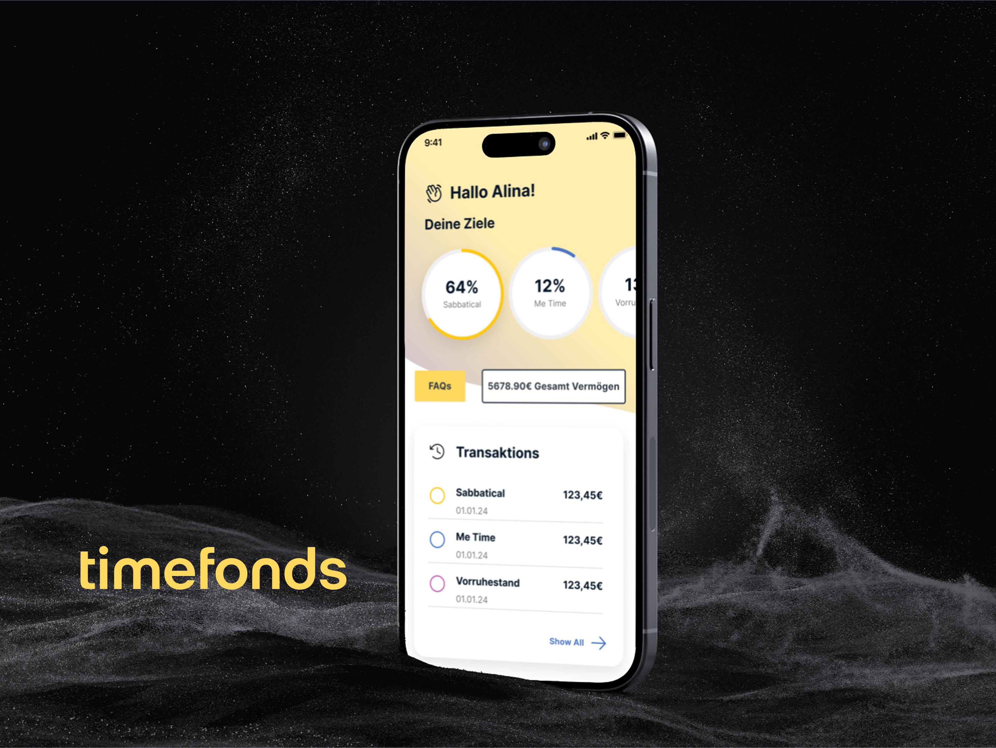
timefonds
During my internship at Timefonds AG, a start-up offering time value account services, I gained hands-on experience in conceptual and visual design using Figma. I prepared existing functions for developers, designed and implemented new features, and created a style guide based on the atomic design principle. A key challenge was designing both a desktop tool for HR departments and a mobile app for employees, ensuring seamless interaction between the two. Weekly meetings with the CEO and project manager provided valuable insight into interdisciplinary workflows, while participatory guidance from my supervisor allowed creative freedom within real project constraints.
-
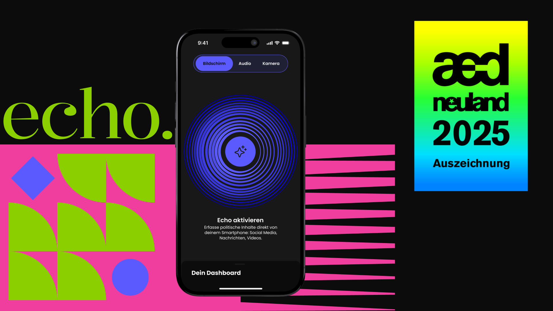
echo
echo is our design response to the shift to the right in society and the increasingly toxic use of social media. The concept is simple: guided news reading. Users can ask context-based questions and receive answers relevant to their own lives. Three modes help capture content from text, audio, or video, while follow-up core questions build genuine understanding and media literacy. A short quiz tailors the experience to each user’s personal context without collecting sensitive data. echo demonstrates how thoughtful design can strengthen political education and become a valuable contribution to a healthy democracy.
-
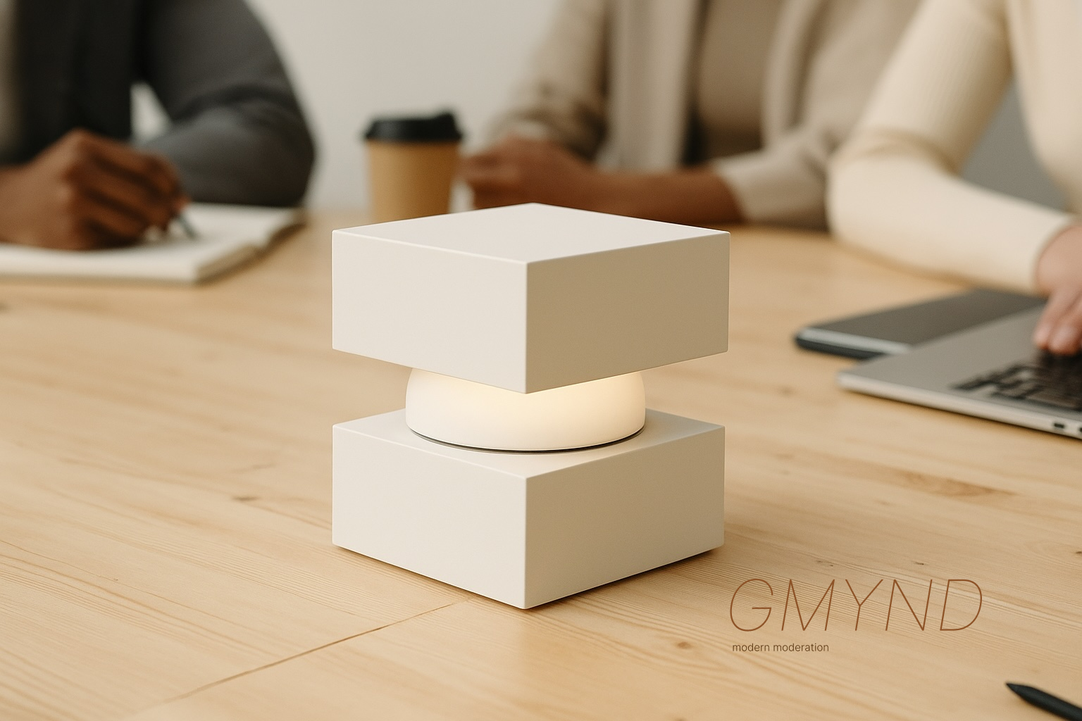
gmynd
Gmynd is a portable, cube-shaped moderation tool designed to make group discussions more balanced and productive. Once activated, it listens, interprets, and visualises contributions directly on the meeting surface via built-in projectors. The device uses subtle light signals to guide interaction: from gentle reminders when someone speaks for too long, to clear prompts when false statements require fact-checking. Touch-enabled projections allow participants to edit content, rank contributions, and prioritise ideas in real time. By combining minimal design with smart conversation analysis, Gmynd creates a space where everyone can participate equally and decisions become more informed.
-
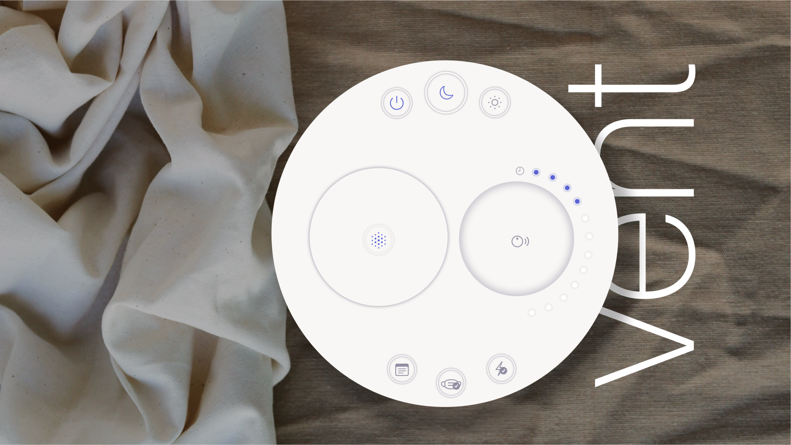
vent
vent is a compact CPAP device for sleep apnea therapy, designed for intuitive and calming use. Interviews with patients revealed that most functions in conventional devices remain unused. vent focuses on clarity and provides a tactile interface that supports only the essential features. A smart ball gives physical feedback on pressure changes and allows users to respond through touch. The visual design plays an equally important role. Its calm, domestic appearance helps the device feel natural in a bedroom setting. The project was developed in teamwork at HfG Gmünd during the Interface Design course.
-
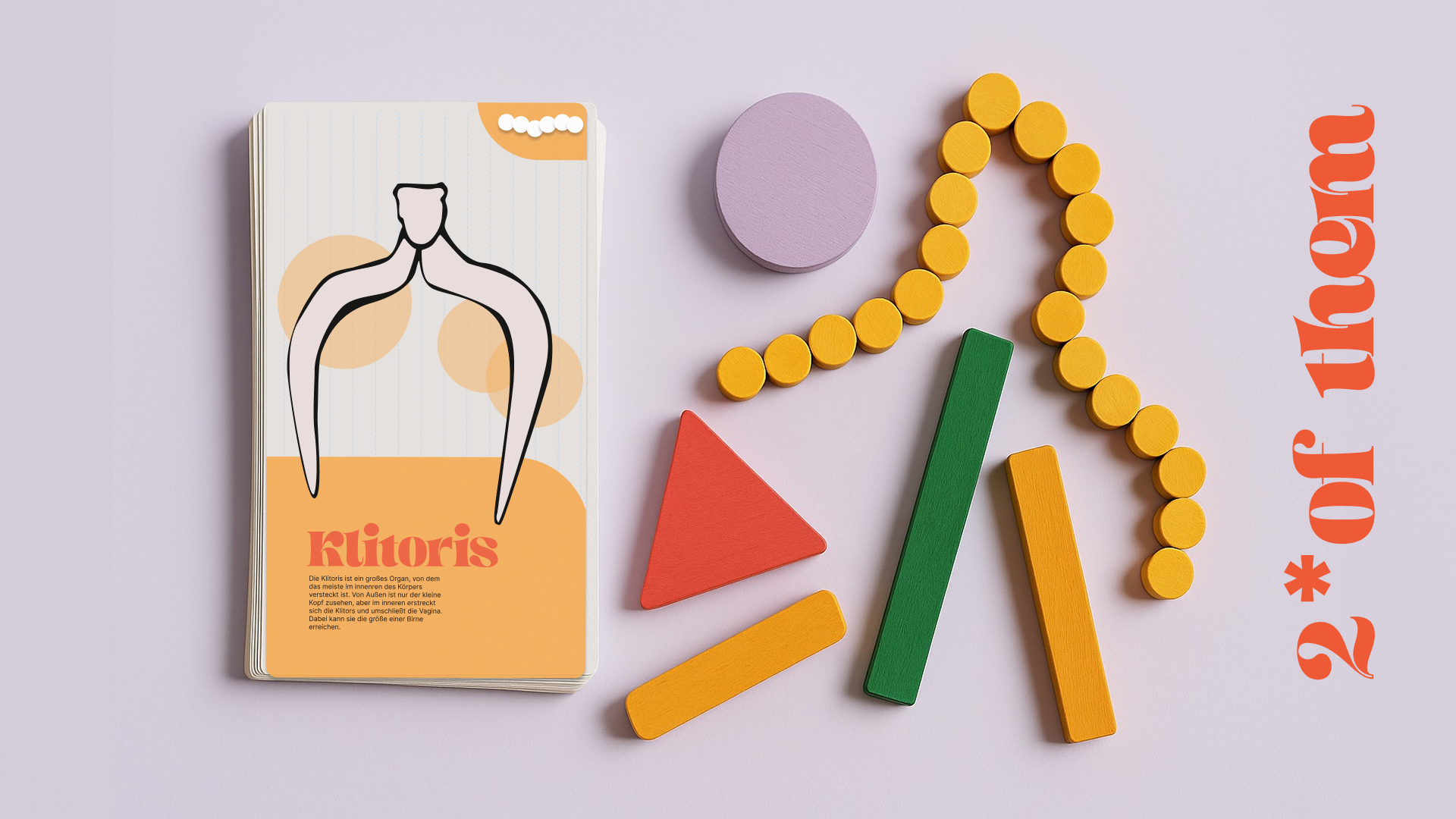
2* of them
2* of them is an analog card and puzzle game developed for sex education in schools. It explores the diversity of bodies and questions binary gender norms. Players draw cards and build anatomical forms using puzzle pieces. Each combination is random. Each result is different and valid. The game uses minimal visuals and inclusive language to create space for conversation without moral framing. Developed during Lab Week at the HfG Gmünd.